
Style SOS: Trend overboard...

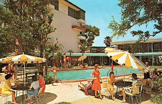
When I was thirteen years old, my parents decided to renovate our home. The process took six months longer than planned and meant that we had to move into a hotel for part of the school year. The Langford was a swinging hotspot in our town. It was everything you might imagine when you think of 1950's and 60s Florida kitsch. In its heyday, it was elegant and chic, with imported architectural materials, hand painted murals and attention to detail. It had a tiki bar, mermaids painted on the bathroom walls, a fancy swimming pool and a conference room with back-lit can can girls on the walls. It even had a zoo. Sadly, it was poorly maintained and within a few short years, by the time we moved in, it had gone from a tropical paradise to a mildewy, rundown, tired old motel. Being that I am the eldest child and the only girl, I always got my own hotel room on family trips. And so it came to be that I moved into the Safari Suite. Now, it wasn't an African Queen safari suite -- it was more Las Vegas strip, replete with masks, beaded curtains, medicine men statues, tapestries, taxidermied tiger heads with their mouths wide open and ready to roar, animal skin rugs and Masai warrior figures armed with swords that stood guard over the bathroom. There wasn't a surface that had not been painted, upholstered or wall papered in some sort of animal print. It was what I would call "high-ungapatchka," and I felt like I was living inside a Serengeti snow globe. I'm certain that this is where I developed a deep appreciation for the concept of "less is more" and my aversion to pretty much anything that has a leopard spot....except for maybe an actual leopard!
Lately, I've been seeing a lot of animal print going around. Leopard is one of those trends that when applied thoughtfully, and with restraint, can be a touch of perfection, but when overdone it's a sensory train wreck. As you know by now, I have little tolerance for anything overstated, and often err on the side of minimal in my own dress and home decor. It really is true that a little goes a long way -- uncluttered, balanced, not necessarily symmetrical styling creates a harmony of elements.
Here are a few visuals that have caught my eye of late...
Overall, I like the foundation of this room...the beamed ceiling and the black and white color scheme. Unfortunately, there are just too many matching patterned accent pillows. On their own, the two leopard upholstered chairs would have made a strong statement. With all the other animal print jockeying for position, the impact of the chairs is lessened. The room is too DONE. I would also lose the tall matching lamps in favor of a mismatched pair. I gather the idea here was to create height, so what is with those tiny green fern-like plants on the side tables?

The room below has a lot going on. The two velvet chairs are the only repeated element, and textures are layered to create an eclectic, balanced look that packs a ton of visual interest. Notice the little ottoman is the only piece of leopard print in the room, and the eye is instantly drawn right to it. Ta da!

While I wouldn't necessarily decorate my own office like this (I'm not a fan of sisal or seagrass...remember the shedding labrador retriever?) I do like the way the wall covering is tied together with the desk chair upholstery. It's just a little touch of matchy-match, but not so much that it's predictable. And even if it is predictable, in this case, it is acceptable! I LOVE the green desk.

Here, the art and books take center stage and the little touch of leopard is a fun, luxurious accent in the room.

In the end, I still think the best uses for leopard are....
a decorative tray...

accessories & shoes...

photos JCrew, Net-a-Porter


the real McCoy...
